Card
View in Storybook
Explore interactive examples and all component variations in our Storybook.
The Card component is a flexible container used to organize and display related content. It provides a consistent structure with header, content, footer, and actions, perfect for products, profiles, articles, and any type of grouped information.
Basic Usage
Card with Footer
Card with Actions
Product Card
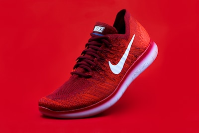
Sports Sneakers
Nike Air Max
New
$299.99
Comfortable sneakers for running and sports activities.
Profile Card
Statistics Cards
Article Card

React
TypeScript
How to create reusable components
Learn best practices for developing React components that can be reused across different projects.
JS
John Smith
March 15 • 5 min read
Card Grid
Properties
Card
| Property | Type | Description |
|---|---|---|
className | string | Additional CSS classes for the card container. |
children | ReactNode | Card content. |
CardHeader
| Property | Type | Description |
|---|---|---|
className | string | Additional CSS classes for the header. |
children | ReactNode | Header content (title, description, actions). |
CardTitle
| Property | Type | Description |
|---|---|---|
className | string | Additional CSS classes for the title. |
children | ReactNode | Title text. |
CardDescription
| Property | Type | Description |
|---|---|---|
className | string | Additional CSS classes for the description. |
children | ReactNode | Description text. |
CardAction
| Property | Type | Description |
|---|---|---|
className | string | Additional CSS classes for actions. |
children | ReactNode | Action buttons or elements. |
CardContent
| Property | Type | Description |
|---|---|---|
className | string | Additional CSS classes for content. |
children | ReactNode | Main card content. |
CardFooter
| Property | Type | Description |
|---|---|---|
className | string | Additional CSS classes for footer. |
children | ReactNode | Footer buttons or elements. |
Recommended Structure
<Card>
  <CardHeader>
    <CardTitle>Title</CardTitle>
    <CardDescription>Description</CardDescription>
    <CardAction>Header actions</CardAction>
  </CardHeader>
  <CardContent>
    Main content
  </CardContent>
  <CardFooter>
    Footer actions
  </CardFooter>
</Card>
Features
Flexible Design
- Modular and composable structure
- Support for different layouts
- Easy visual customization
Responsive
- Adapts to different screen sizes
- Integrated responsive grid
- Mobile-optimized layout
Versatile
- Suitable for various content types
- Support for images, icons, and media
- Integration with other components
Common Use Cases
The Card component is perfect for:
- E-commerce - Product cards, item comparison, shopping cart
- Dashboards - Metrics and statistics, charts and visualizations, data summaries
- Content - Articles and posts, user profiles, portfolios
- Interfaces - Settings panels, feature showcases, navigation elements
- Social media - User posts, activity feeds, profile information
- Documentation - Feature explanations, API references, tutorials
Best Practices
- Maintain clear hierarchy - Use CardTitle and CardDescription appropriately
- Limit content - Cards should be scannable quickly
- Use quality images - Optimize images for different screen densities
- Consider actions - Place primary actions in footer, secondary in header
- Test responsiveness - Check behavior on different screen sizes
- Maintain consistency - Use similar patterns for cards of the same type
- Accessibility - Ensure cards are keyboard navigable and screen reader friendly